In 2015, there was a review on the hottest trends in web design. Today, we will take a step back in time and see which of the trends listed in 2015, still retain currency in today’s web landscape, along with some new trends for 2017.
Minimalism
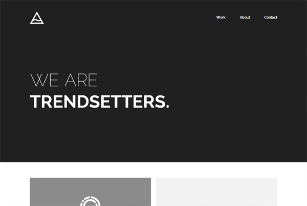
Minimalism has definitely survived and it could be easily considered ageless now.
Why wouldn’t it be? It is clean in looks, aesthetically pleasing and focuses on the core proposition being offered. Want more? Additional links can then take the User to specific areas of content. With brands now wanting to ensure users’ focus is on the right content, minimalism is here to stay.
App like menus or Experimental Navigation
With the advent of ‘mobile first’ strategy in 2015, many brands began adopting the mobile style User Interface for the desktop version. As of today, it remains a trend that is still prominent amongst many brands.
Ghost Buttons
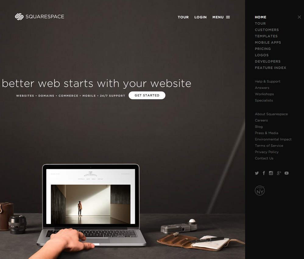
Ghost buttons have only changed marginally since 2015, though still hold favour with many brands. Expect to see this trend continue in 2017.
2017 web design trends
Experiemental Nav’s
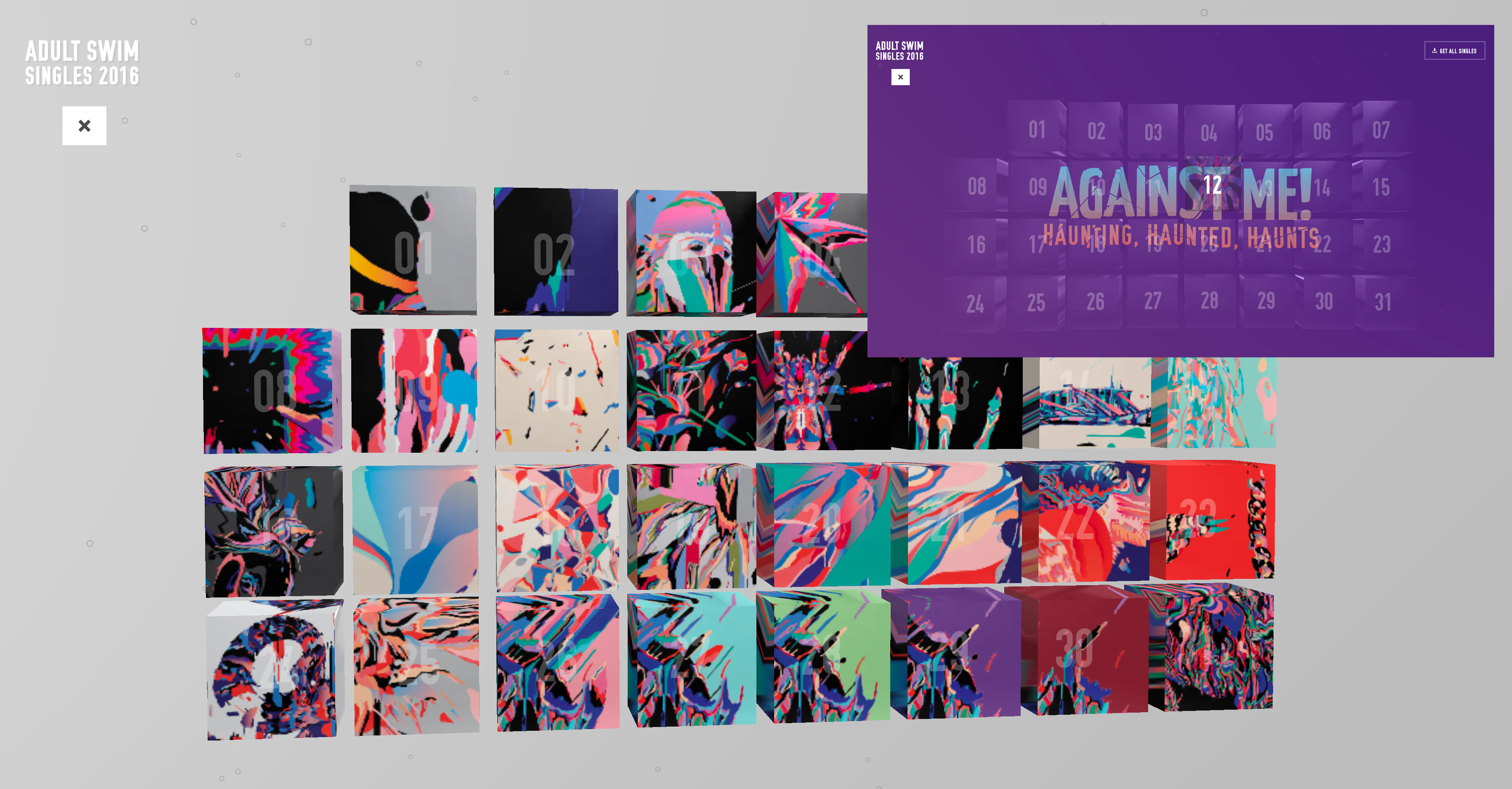
In 2017 we are beginning to look at ‘experimental navs’ – non-traditional navigation design. Adultswim.com uses a bold, 3D block type menu which has fluid rollovers. This is a significant departure from traditional or hamburger menus.
Content focused layouts
In 2015 a lot of focus was on specifics within the layout design. Think ‘hero images’; three call-to-action sub-headings; parallax scrolling; bold typography and more.
For 2017, content is leading the format for layouts and designs of a website. Content is truly on the way to being ‘king’, with User Generated Content; social media integration and all things digital, playing a large part of why a user comes to your website. Designers and developers have realized that simply being pretty doesn’t ‘cut the mustard’ in keeping the user actively engaged.
Bold statements, Inspiring copy
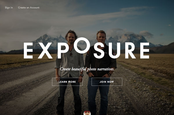
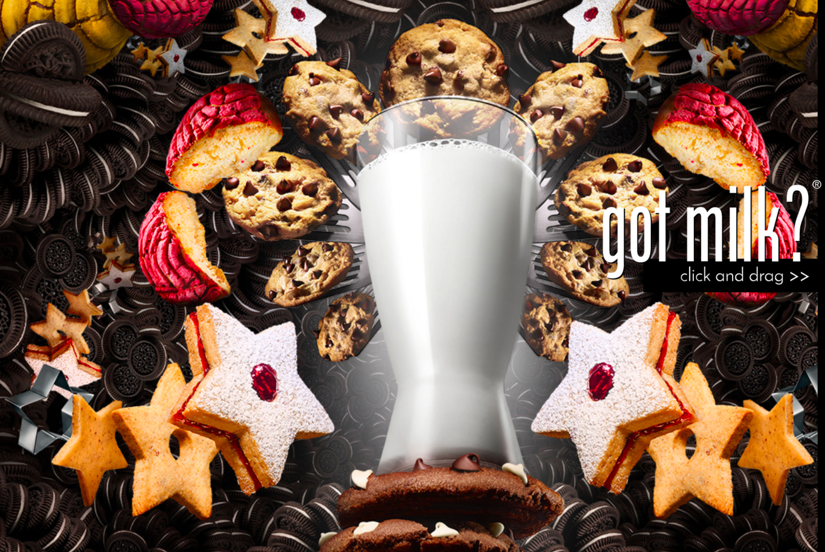
One of the hot trends is the use ‘eye-catching content’. This can be in the form of inspiring, high quality imagery, typography or a combination of both.
This style both confirms and works hand-in-hand with the minimalism trend that started back on 2015.
It is also a key element in determining the branding guidelines and how you wish to be perceived by the community at large. Digital design in itself is emerging strongly from the traditional advertising and marketing space associated with hard copy. Add User Experience to the mix, and these two elements will most certainly lead the charge in 2017 and beyond.
Scalable Vector Graphics (SVG)
When Apple released retina display, SGVs were ready for the change.
SVG files are vector files which allow graphics to scale evenly on different devices, with different screen-sizes and resolutions whilst maintaining clarity. With screens and devices getting more and more advanced, SVGs are still the ‘go to’ option, and remains one of the hot trends in web design.
Keep an eye out for second part of this article, where we will explore more hot trends for 2017 and beyond.
Now, if you are ready to get a perfect website or a web application, come and talk to us.

Comments are closed.